Rarely exclusive task – to intervene in the building of the Zadar Archaeological Museum designed by Mladen Kauzlarić, to touch the untouchable masterpiece of Croatian architectural modernism, to interpolate in the celebrated interpolation. Precisely such a task was given to Iva Letilović and Igor Pedišić in their design for the exhibition setup of the Zadar Collection of Antiquity, located on the first floor of the renowned Kauzlarić’s modernist building. Intriguing was, therefore, to try to resume and reenact Kauzlarić’s own design gesture: the same as Kauzlarić used the perfect crystal of his museum building to boldly match the neighboring grand historical monuments – St. Donatus Church, St. Anastasia’s bell tower, Roman Forum, and the whole valuable historical urban context – so the new intervention should courageously match its own canonical modernist framework.
With his museum building Kauzlarić famously solved the remaining nexus of the Zadar postwar urban reconstruction – the very heart of the city, the intersection of the Cardo and the Decumanus. He intervened by inserting the resolutely clean slab of his modernist museum in the highly heterogeneous urban fabric. On its front side, the building fittingly evoked the frontage of the historical Forum, while on its back it properly enclosed the complex of the medieval Benedictine monastery. Sufficiently suggestive and strong to figure as a façade of the archaeological locality of the ancient Roman square, it was simultaneously sufficiently neutral and clam to figure as an adequate background for the dense plasticity of the neighboring historical edifices. A gesture courageously autonomous, just as considerately contextual. The long-awaited new exhibition of the Zadar Collection of Antiquity entered this manifestly modern space in a quite daring and resolute way. It emerged as a new volume, a new object, as an inserted compact body – architecture within architecture, prism within a prism. Raised on a plinth, on a podium pulled back from the perimeter of the museum walls, the elongated prism of the new exhibition setup repeated the very operation of the original museum building.
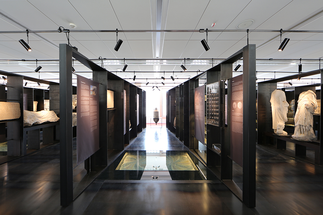
The act of creative matching necessarily includes also creative contest, counterpoint, and juxtaposition of equally strong, yet mutually complementary concepts. In this case, the new block entered with a determination of a steel case into a framework of reinforced concrete volume; with the thickness of a black box into the envelope of a light, white space. Leaving the existing spatial frame almost intact, the authors decided to intervene only on two original elements: on the plane of the floor, and that of the entrance wall. They colored them resolutely red, which – in a dialogue with the black steel case – initiated a passionate Stendhalian game. The strange black box, at first seemingly impenetrable and closed, forwards an implicit invitation to enter by offering an easy access ramp. Once on the platform, approaching the full black wall, the visitor accidentally discovers a slit, a gap, an opening, and enters – a true cabinet of curiosities: those of assembled archaeological artifacts, just as those of profuse architectural sensations. Initially solid and dense, the full block curiously dematerializes into a series of porous frames, producing astonishing spatial effects, and absorbing the visitor into the orbit of unique visual impressions.
Porous spatial frames are, in fact, elaborated exhibition vitrines, rendered in unusual wedge-like forms. All of the same height and structured by the same modular principle, the vitrines are conceptually and geometrically uniform, if allowing the possibility of permutation and change. Made of flat steel, of only five millimeters in section, they are manifestly thin compared to the size of the overall volume, thus evoking the visual category of paper. The underlying generic modular grid gets highly personalized and differentiated when materializing into concrete vitrines, depending on specific artifacts. And the artifacts differ in an impressive scale – from miniature gemstones up to huge stone slabs and plaques; form coins, fibulae and fine jewelry up to massive sarcophagi and parts of portals and temples; from fragile Roman glassware to glittering marbles; from small plastics and portrait busts up to colossal statues. All that variety, in every possible sense – that of sizes, materials, weights, types, and colors – was supposed to be held in visual harmony by way of a single underlying system. In the corresponding gamut of variously treated segments of the frames, the only constancy turn out to be the basic spatial principle and geometry, just as the desired effect that the artifacts should effortlessly float, detached from their pedestals so to convey their own autonomous historical importance.

The serial sequence of wedge-like vitrines, stretched all throughout the elongated museum space, forms equally peculiar intermediate spaces – trapezoidal spatial niches organized as individual thematic units. The clear trajectory of the procession route enhances the clarity of the curatorial concept. From the entrance to the end, various thematic segments follow in a row, each housed in its own trapezoidal recess: the topic of historical context, architecture and urbanism, economy, politics, husbandry, everyday life, religion, and art. Though clearly separated, the individual recesses are also mutually integrated, connected by cross views that penetrate trough the semi-permeable vitrines. Equally carefully structured are gazes which run down the aisle of each individual recess: at its narrower end, each niche ends up with a fissure through which the gaze is invited to proceed outwards, to reach Kauzlarić’s modernist windows, and through them out, into the city, to meet with the living urban monuments.
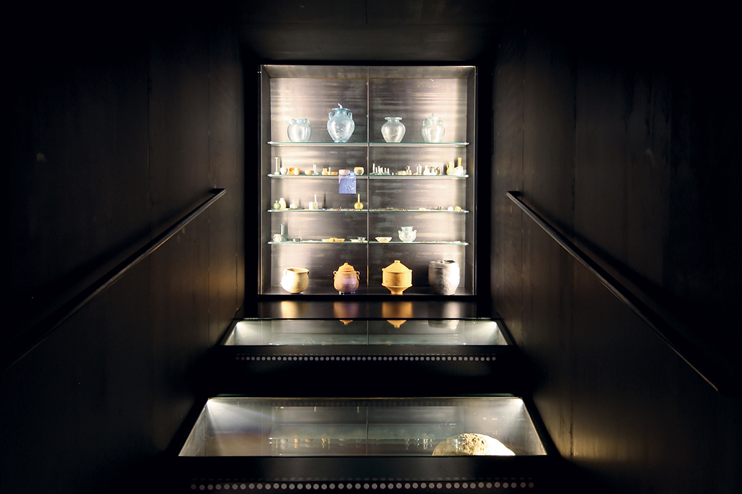
After a sequence of nine niches identical in plan, the tenth is organized completely inversely. Quite reasonably so: if the first nine niches problematize various aspects of life, the tenth represents their reverse analogue, addressing the topics of funeral rites, interment, and afterlife. Closed and introverted, inversely trapezoidal, it absorbs the visitor completely into its dark metaphysical world. There it activates the plasticity of the floor, bending it to form ascending stairs in which it displays various ways of burial. Yet the exhibition trajectory does not end in these spiritual themes; it continues further and culminates in the last segment of the exhibition space and the apex of the exposition – the famous Nin Imperial group. Free and detached, the sculptures of Roman emperors stand outside the system of the vitrines, as freestanding marble statues placed directly on the black podium, and set against the background of a slanted dark steel plane that renders appropriate contrast to their striking white appearance. With this last segment, placed right in front of museum windows facing the Kalelarga Street, the whole repetitive system of the Zadar Collection of Antiquity appropriately ends.
However, here is not the end of the exhibition trajectory proper; next to imperial statues, the ramp slowly descends from the platform to the level of the original Kauzlarić’s floor. From there, walking down the red passageway, the visitor returns to the entrance point. The way to the exit thus overlaps with the cantilevered zone of the museum, bringing the visitor in direct contact with the row of Kauzlarić’s original white columns, and the horizontal panoramic window. Looking through the huge rectangular openings, the visitor thus recapitulates the encounters with the living history of the city, capturing views also of the Roman Forum, whose fragments of bygone life have just been presented by the exhibition. As a reminder of the exhibition’s themes, a row of highlighted artifacts borders the passageway, one representing each niche, which is placed directly on the steel pedestal that rhythmically protrudes the perimeter of the compact steel box. As particularly strong visual leitmotifs of thematic units, they remind of the spatial and curatorial structure of the overall exhibition. And further on, with their clear regular rhythm, these historical accents establish metrical harmony with white modernist columns, pointing to the overall logic and modular grid of the museum’s load bearing structure. The fact that the new exhibition setup is raised on its own podium has reasons other than just designating the exhibition’s area within the broader floor surface. This podium also has precise functional and technical justification. Firstly, the platform itself accommodates exhibits of Roman floor mosaics, thus becoming a specific display vitrine. And secondly, it is vital in a structural sense too: namely many exhibits weigh up to two tons, so the platform accommodates in its height a secondary steel structure, which abridges the primary construction spans and prepares the field for unobstructed placement of massive artifacts. So the new podium, as is apparent, possesses multiple overlapped purposes – spatial, functional, and constructional. And with this, it proves a conceptual relative of Kauzlarić’s own museum platform. The same as Kauzlarić decided to raise the entire body of his museum onto the podium not only to make it suggestively float above the levels of historical streets, but also to insert beneath it the narrow slit of windows by which to illuminate the basement floor, so also Letilović and Pedišić justify their own podium by superimposed spatial, functional, and constructional purposes. The decision to reenact Kauzlarić’s original operation is, therefore, multiply justified, just as it is profitably employed.

Similarly profitably applied here is yet another inherited gesture – that of careful positioning of the podium with regard to the broader floor surface. Kauzlarić used this technique to respectfully retract his museum building from the border lines of historical streets, thereby suggesting the historical width of the Roman Cardo and Decumanus. Analogously, Letilović and Pedišić exploit the same beneficent strategy for their own purposes – that of clear functional definition of the floor space. Asymmetrically positioned steel platform on a symmetrically arranged floor creates four different functional zones, as left-overs which remain at the red terrain after retracting the platform from the perimeter wall: the biggest, entrance zone; then the smallest, behind the imperial statues; then the narrow lateral strip functioning as the exit passageway along the panoramic windows; and finally the strip parallel to it, at the other side of the museum, facing the monastery complex, and the interior of the block. That narrow strip of space, perhaps slightly less attractive, is hidden behind the rear wall of the elongated exhibition box and functions also as a passageway, but an internal one, as it serves as the collection’s secondary depot. In this way, the strictly symmetrical Kauzlarić’s space is confronted with a refined asymmetrical spatial gesture, itself a result of registered differences in broader urban context. And although of an interior character and scale, the new intervention thus proved resonant of a far larger context, and affirmed itself as a full-scale, complete architecture. This intervention skillfully abridged and condensed different scales – all the way from the level of the city down to the level of details, from an exhibition mise-en-scène down to the spectrum of spatial sensations – and accomplished an extraordinary outcome worthy of the initial challenge.